
Impact
25% increase in overall checkout conversion
Team
Product Manager, Engineering
Role
Product Design Lead, UX Research, UX strategy, Visual Design
The Plantix Partner App is a digital platform designed to support Indian agricultural retailers in managing and expanding their businesses.
Through this app, retailers can purchase a wide range of agricultural products, including seeds, pesticides, fertilizers, and more, from over 40 brands.
User Base
150,000 Retailers across 10 Indian States
The user base was scaling rapidly but the checkout experience couldn’t keep up and it started hurting the business.
Revenue Bottleneck
More users didn’t mean more revenue. The conversion funnel was leaking at checkout, signaling poor scalability and missed opportunities
Support Spike
The support teams are burdened with excessive calls from customers who have questions about the purchase flow.

Before jumping into solutions, I wanted to dig deeper into the root of the problem. While the surface-level issues were easy to spot, understanding the why, what, and how behind user behavior was crucial.

Old flow
Quantitative Funnel Analysis
Over a 30-day period starting September 26, we tracked the journey of unique users through the checkout funnel. This helped us identify drop-off points, understand where users were hesitating, and gather quantitative insights that would shape our design direction.

Qualitative Field Studies
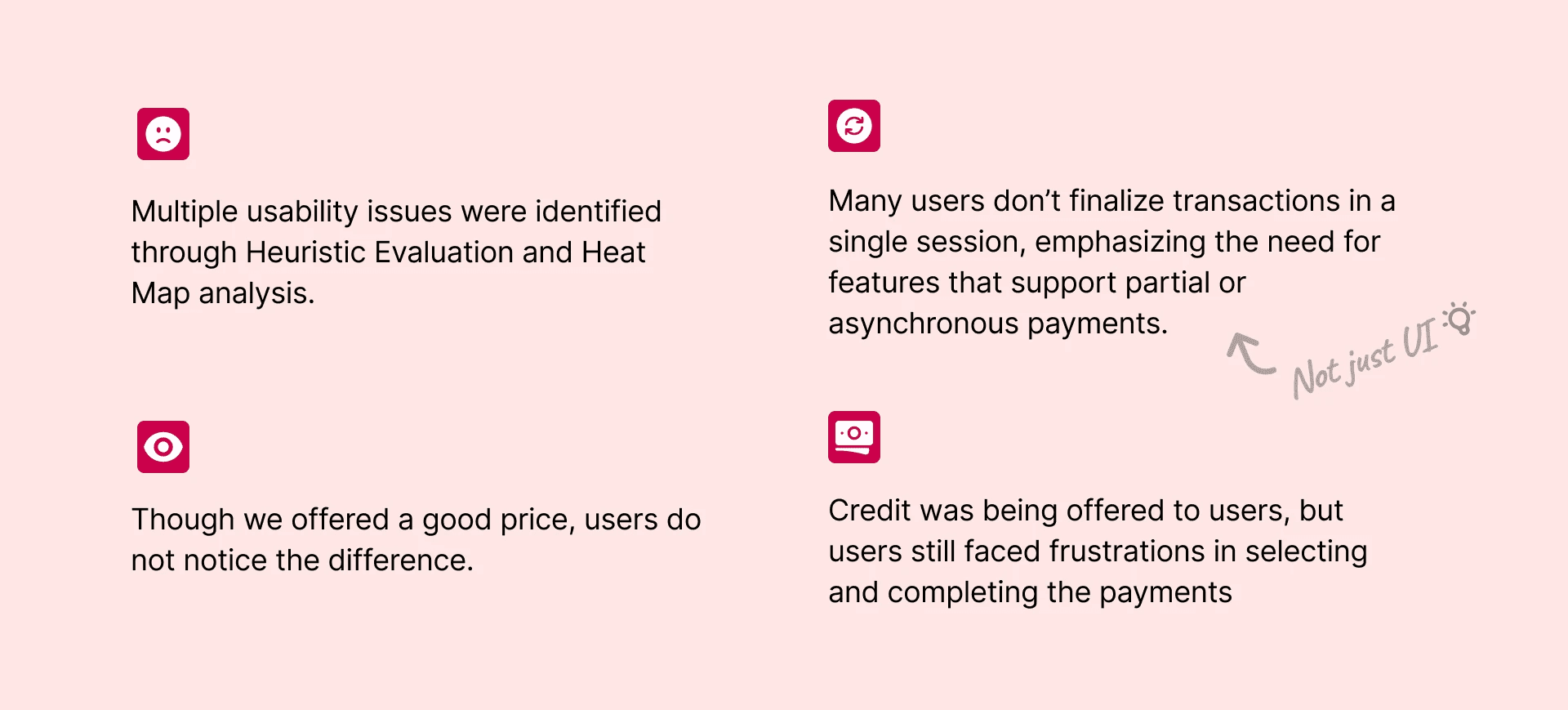
To understand the natural buying behavior of agri-retailers and discover the core pain-points with Plantix purchase experience, I visited 8 users who had recently abandoned their orders on the app.
6/8 Retailers prefer credit payments
5/8 Retailers do not have their business bank account linked with their mobile. They usually pay through Bank Transfer which resulted in dropping through payment flow.
3/8 felt confused about the price and abandoned the order

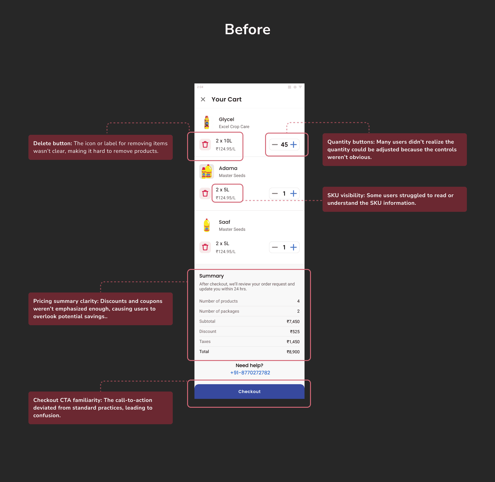
Cart Page Redesign
The usability studies and analytics pointed out multiple friction points on the cart page so it was an easy decision to completely redesign it. There was a 50% drop-off on cart page itself which was quite high considering the users have pretty high-intent to purchase. With the following usability fixes, this conversion increased to 80% over the next 30 days after the release.

Payment Page Redesign
User research showed that our existing payment screen was a significant source of frustration. While we offered multiple payment methods (including Credit and Bank Deposit), the interface lacked sufficient guidance and context for users to confidently proceed. Each payment option was linked to a third-party integration, causing the user to exit the checkout flow when they clicked on any method making it challenging to compare different methods side by side.
Redesigned Payment Screen:
All the payment options on one page.
Improved information hierarchy and clarity by displaying key details such as remaining credit balance, wallet balance and pricing summary.
Flexible Payment Options: Razorpay smart collect payment method along with Rupifi credit integration allowed for the seamless payment through various payment methods right in the app.
Impact:
The conversion on payment page improved from 21.9% to 45.5% (↑38% cumulative) within 4 weeks of the feature release. Finance and Accounts teams also reported that the time between order being placed and payment reduced considerably. There was also a significant drop in unpaid orders and duplicated orders because of payment issues over 3 months.

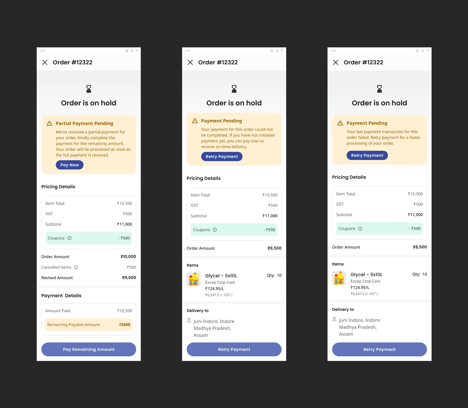
Improved Error Handling & Support
Field research revealed that many retailers don’t want to pay immediately upon starting the checkout. Some prefer asynchronous payment methods, for instance, depositing funds into Plantix’s bank account at a later time. But, this approach led to significant delays in payment confirmation and sometimes prompted retailers to place duplicate orders when they attempted to retry or switch payment methods.
To mitigate these issues and streamline payment recovery, we introduced clear, in-flow mechanisms to handle partial or delayed transactions:
Order On-Hold State
When a payment wasn’t completed or remained pending, the system automatically flagged the order as “On Hold,” ensuring the retailer knew their order could still be finalized without starting over.
Asynchronous Payment Guidance
For retailers opting to deposit money manually, we provided step-by-step instructions and a dedicated status tracker indicating when the payment was received.
Users could easily resume their transaction once the deposit was confirmed, avoiding confusion about whether to place a new order.
Retry Payment Options
“Retry Payment” button let users quickly reattempt the transaction with the same or different payment method—reducing the need to abandon or duplicate orders.
Transparent Pricing Details
Even if the payment was pending or partially complete, the pricing breakdown (item total, taxes, coupons, etc.) remained visible to maintain clarity on what was owed.
In-App Support
Users encountering complex issues—like delayed confirmations—could contact support directly via chat or call, speeding up resolution and reducing unnecessary cancellations.
Impact:
By accommodating delayed and partial payments while offering clear, guided recovery flows, we significantly reduced the rate of lost orders and confusion arising from asynchronous payment methods. Retailers could manage their cash flow more comfortably, and Plantix benefited from fewer duplicates and higher overall checkout completion.
Though we were continuously iterating on the design optimizations, here's what the flow looked when we saw significant improvement in the conversion 🔥
These improvements directly addressed the key drop-offs identified in our funnel data. By reassuring retailers about fairing pricing and offering easy to understand and flexible payment options, we overcame the critical bottleneck in our purchase flow.
Cart to Begin Checkout Conversion
Proceed to Payment
Payment to Order Placed
Overall checkout completion
These incredible results were not achieved in a day or even matter of weeks. During the course of 2 quarters, we iteratively tested the design improvements through various methods:
A/B Testing & Rapid Prototyping: Validated new flows and micro-interactions to confirm which changes had the highest impact on conversions.
Continuous Feedback Loops: Monitored analytics post-launch, gathering user and stakeholder input for iterative refinements. Customer Support staff was of a huge help throughout this process.
Agile & Cross Functional Collaboration: Close alignment with Sales, Ops, and Marketing ensured design decisions balanced user needs with business objectives.
Data + Field Research:
Starting the research with Data Analytics is important, but combining it with real world observations is equally critical to actually understand the user pain points. We began this project to improve revenue, but after speaking with retailers, I realized that a smooth user experience is essential for them to grow their own businesses as well. Even small errors can lead to big frustrations—this is their livelihood, after all.
Collaboration:
This project involved numerous stakeholders across Product, Sales, Operations, and Support. Working closely with these teams taught me the importance of collaboration and communication to align design decisions with broader business objectives and ensure a cohesive user experience. I also learned how to present and defend my design decisions to people not familiar with design processes.
Iterative Process:
The final results were not achieved in a few weeks. We did multiple rounds of testing including A/B tests, Guerilla testing, prototype testing, heuristic evaluations and design critics to eventually move the numbers. Each iteration brought us closer to a seamless, user-friendly checkout experience, proving that incremental improvements can lead to substantial results.